Grafana
Grafana is a handy and flexible tool for data visualizing and monitoring, which pulls data from the database. You can customize all the displayed graphs, tables, or columns using queries.
More details: https://grafana.com/docs/grafana/latest/
Installation
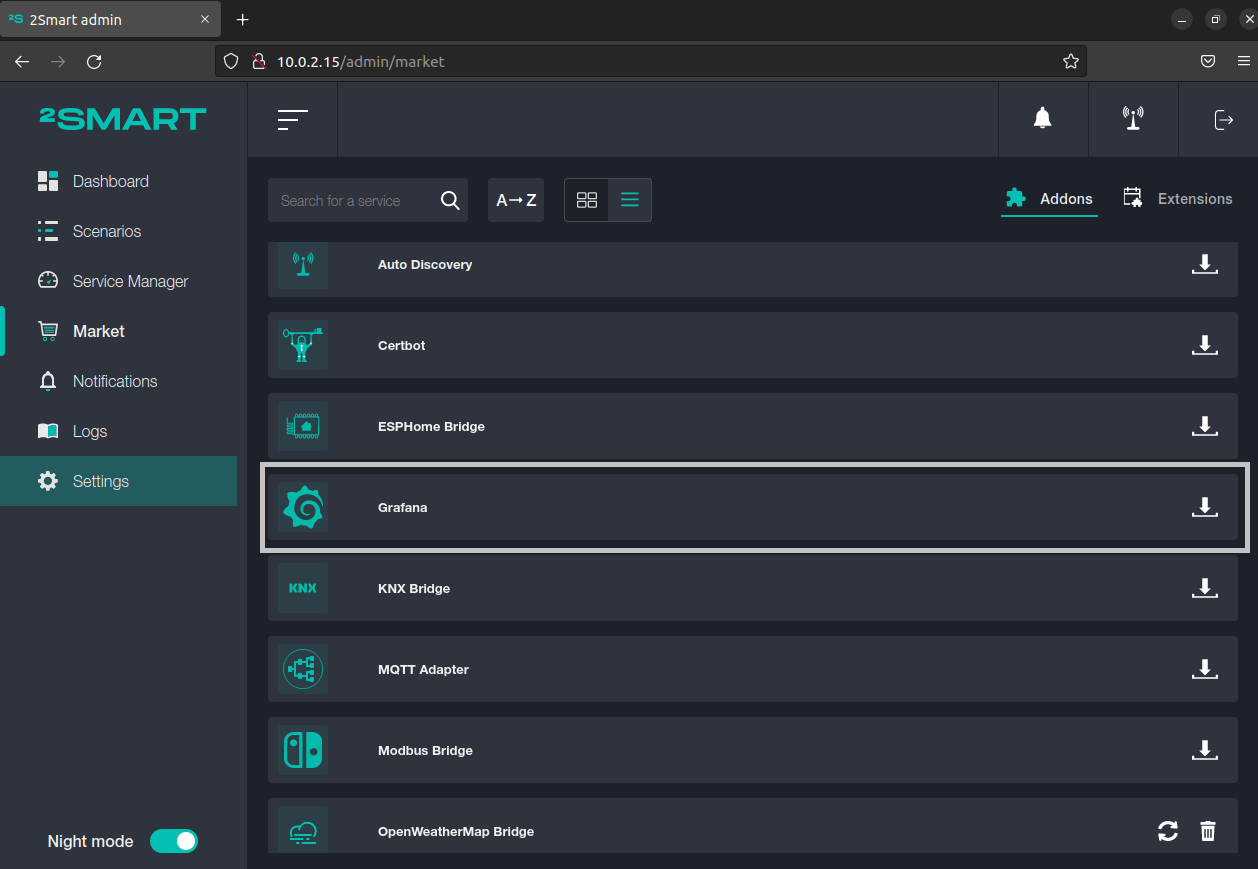
On the Market page, open the Addons tab and click on the download icon near the Grafana addon.
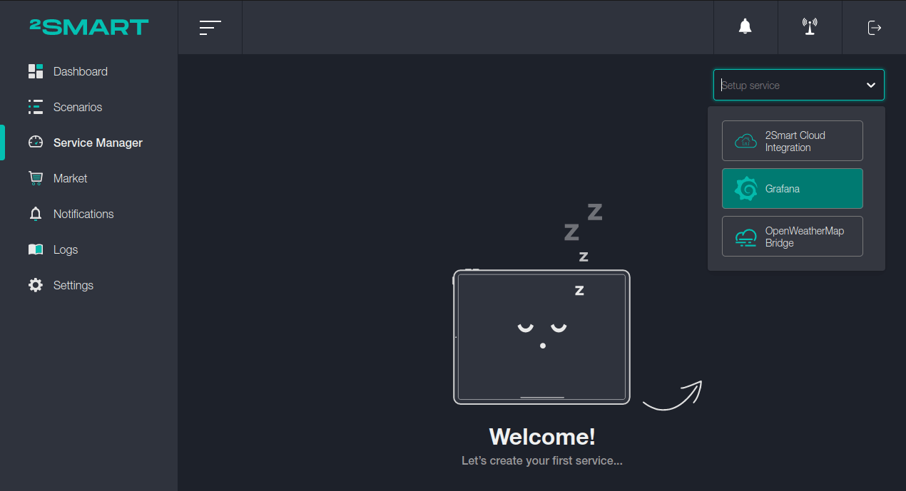
On the Service Manager page, click on the “Setup service” list and select the Grafana addon.
Setup
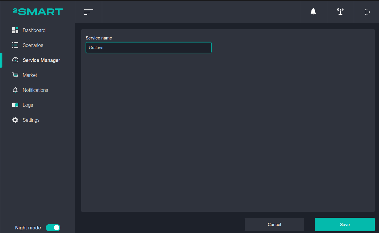
Enter the name of the service and click on the “Save” button.
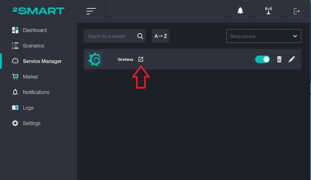
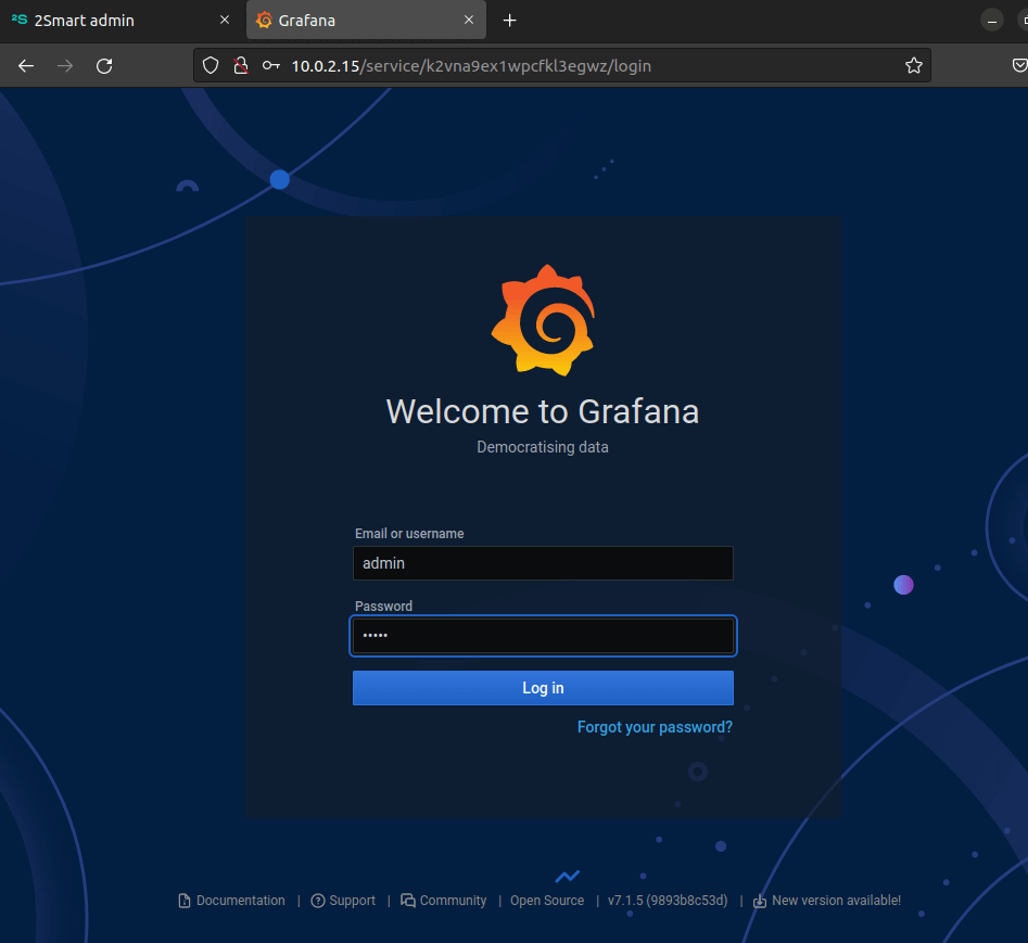
To enter the Grafana admin panel, launch the bridge, and click on the icon next to its name.
To log in, use these default credentials:
- login: admin
- password: admin
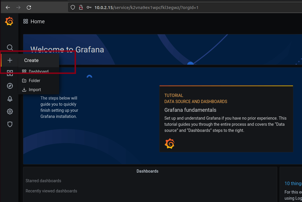
To create your first chart, click on Сreate in the "+" menu.
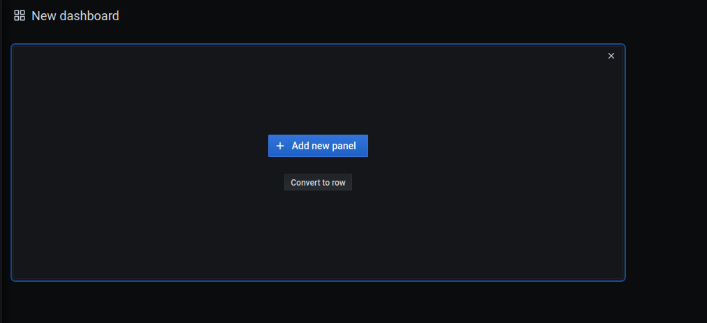
Create a new panel by clicking on the "Add new panel" button.
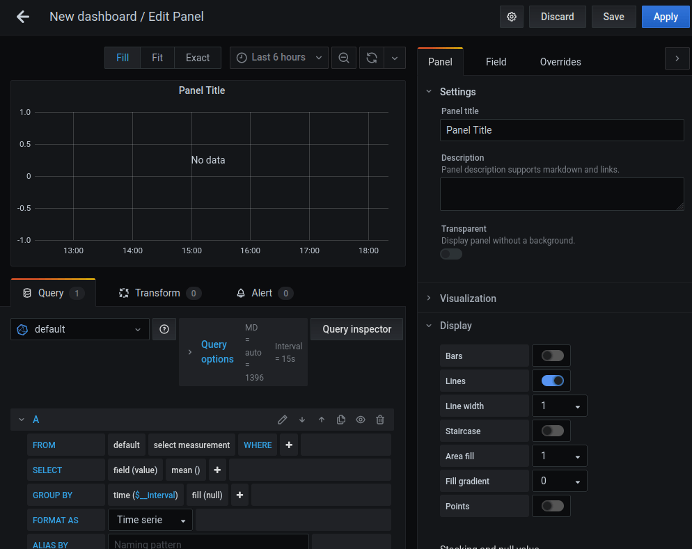
Grafana created an empty graph. The example below will show how to set it up for temperature monitoring.
The current air temperature data will be obtained using the OpenWeatherMap bridge.
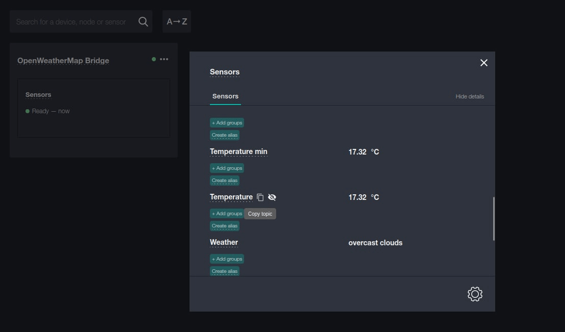
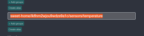
Copy the temperature data topic and transfer them to the Grafana parameters.
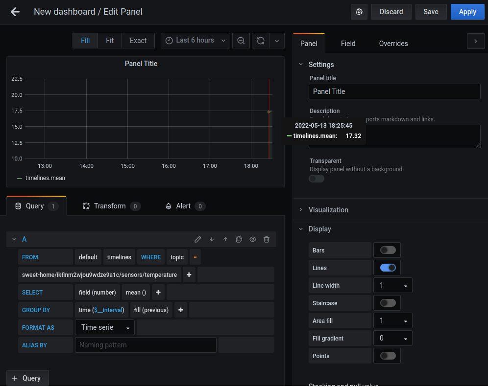
Settings comments:
- In the FROM section, choose a default timeline that pulls values from the topic.
- In the Select section, choose a "field (number)" so that numbers would be read. Since was specified a string, it will not see any data.
- In the Group by section, leave the default value to show the entire period involved. Choose the "fill (previous)" indication.
"Fill" is a way to fill data between two values. For example, if the value 10 arrives at 13:00 and value 50 arrives at 13:20, then fill previous will display 10 until 13:20.
After completing all settings and data collection, the following graph is obtained.
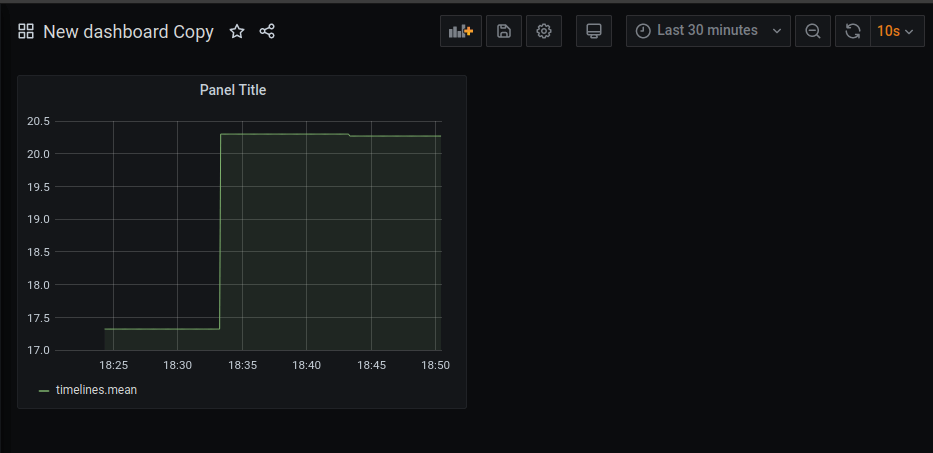
At the top right, you can set the display range. In this example, that is data for the last 30 minutes + auto-updating data every 10 seconds.
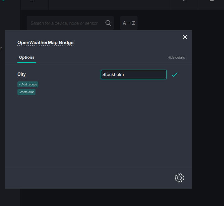
For another example, let's change the locality in the OpenWeatherMap bridge to see what the temperature will be there and how the graphs will display it.
The air temperature on the graph is about 20 degrees. To select a colder area, let's specify Stockholm.
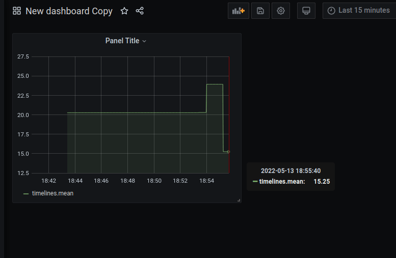
The new graph shows that the air temperature in Stockholm at the time of drawing up the chart was about 15 degrees.
The example above is a tiny part of the features that Grafana provides. Using this tool, you can create a variety of screens with graphs that visually display the data statistics of your devices. Pay attention to the color schemes and other flexible graph configuration options. For details, see the documentation for the tool.